hello@inicioagency.com
Minimalist branding for organic skincare – Pure Beauty
An organic skincare brand that prioritizes natural and sustainable ingredients. By implementing a minimalist branding approach, Pure Beauty conveys transparency and simplicity in their skincare philosophy.
Visual Identity
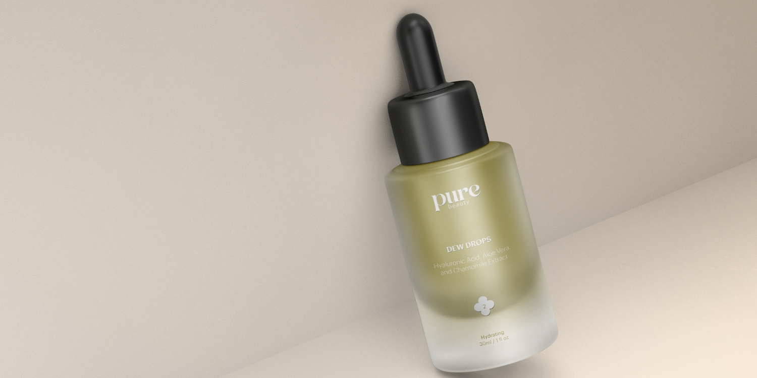
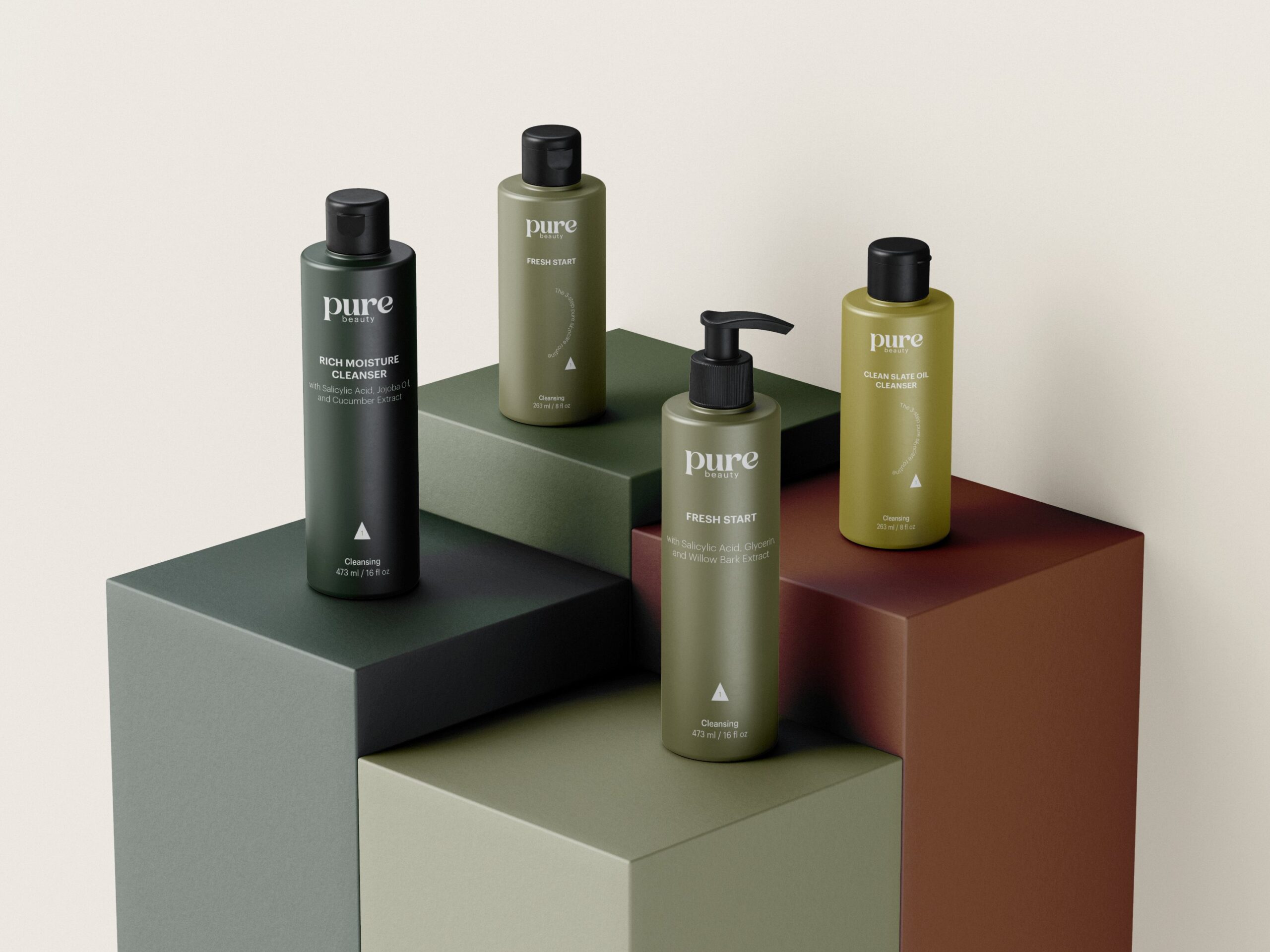
Earthy Tones: The color scheme, consisting of shades of green, signifies Pure Beauty’s connection to nature and organic ingredients. These earthy tones evoke a sense of freshness and authenticity, aligning with the brand’s values.
Minimal Typography: The use of minimal typography reinforces Pure Beauty’s clean and uncluttered aesthetic. The classic, modern, and readable font choice ensures clear communication, enhancing the simplicity of their approach.
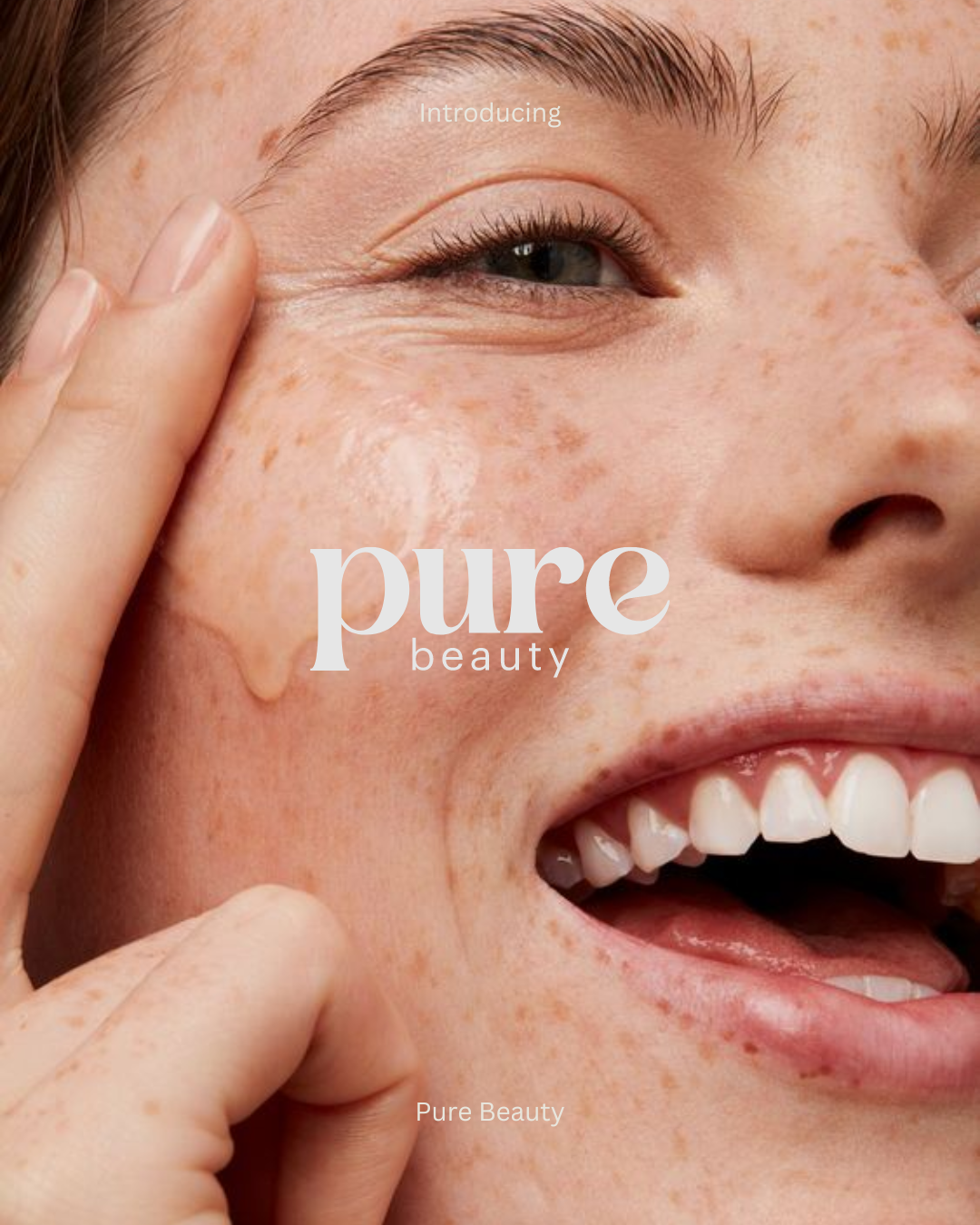
Friendly Logotype: The friendly logotype design establishes a warm and approachable brand image. It fosters a personal connection with customers, inviting them to explore Pure Beauty’s organic skincare products.
Strategy
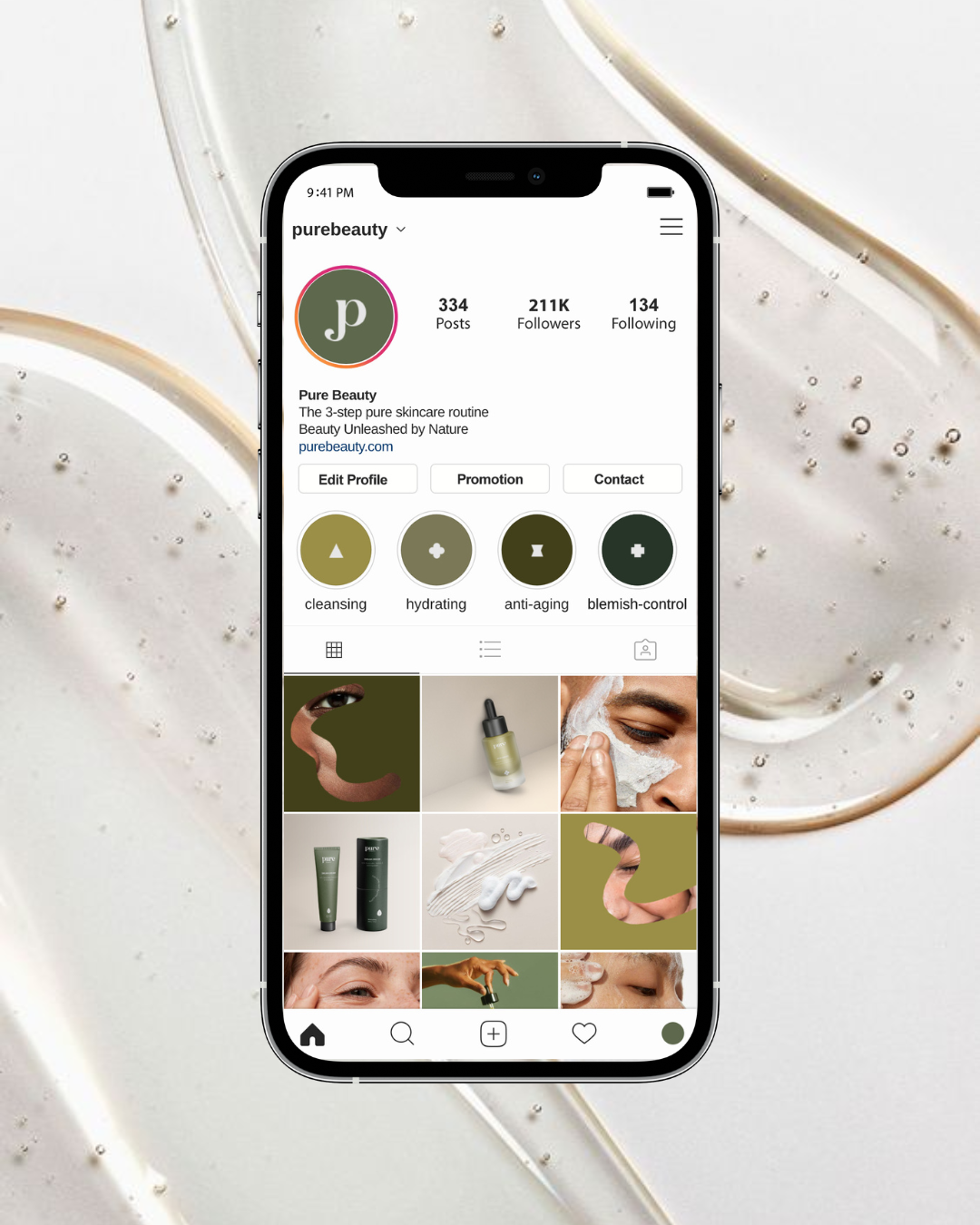
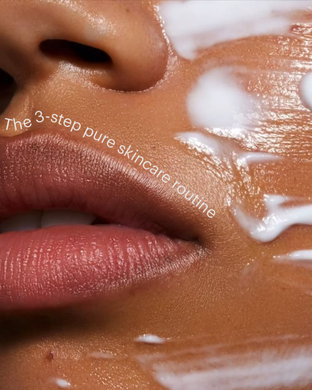
Pure Beauty’s social media presence echoes their mission of promoting a simple and clear skincare routine. The visuals should reflect the brand’s minimalist aesthetic, utilizing clean and uncluttered compositions. The messaging should encourage their audience to embrace a simplified approach to skincare, highlighting the benefits of their ‘3-step skincare routine.’ Providing professional guidance on product application and emphasizing the ease of use will resonate with customers seeking a straightforward skincare regimen.
Additionally, the collection of shapes acting as icons for different product categories enhances the minimalist and uncluttered look, facilitating easy navigation and product selection.
