hello@inicioagency.com


Playful and muted colors for skincare brand – Scrub
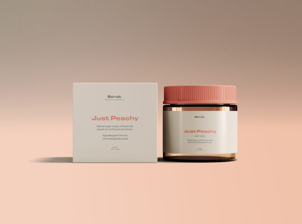
Scrub., an exciting startup specializing in natural sugar scrubs. As a company committed to offering dermatologically tested and hypoallergenic skincare products with simple ingredients, Scrub. entrusted our branding and packaging design expertise.
Background
With a focus on natural, organic goodness, Scrub. aims to provide a refreshing and indulgent experience for its customers, elevating their self-care routines and promoting a sustainable approach to beauty. The brand’s primary target audience is the vibrant and socially conscious Gen Z demographic.
Visual Identity
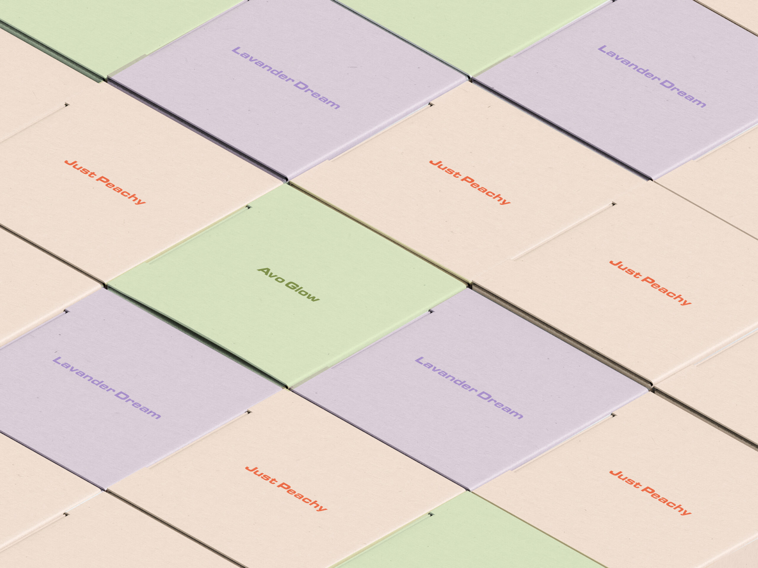
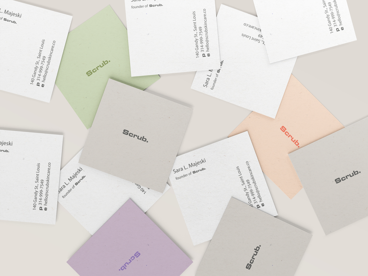
Playful yet Muted Colors: The color palette was chosen to create a harmonious balance between playfulness and organic appeal. The muted tones added a touch of sophistication, while the playful colors resonated with the target audience’s youthful energy and vibrancy.
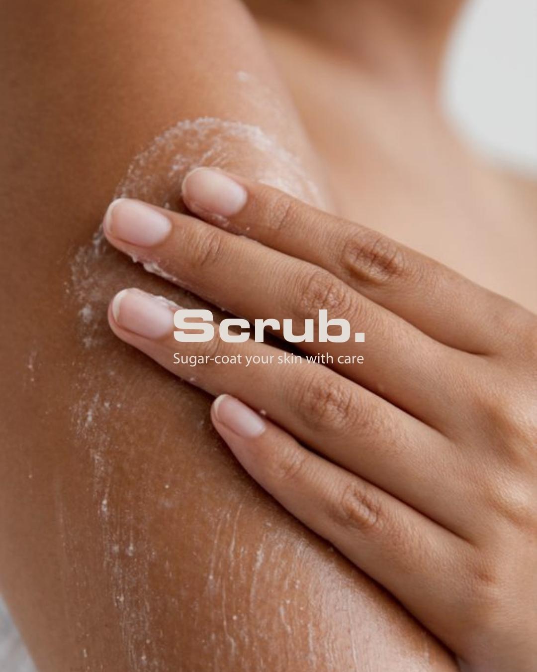
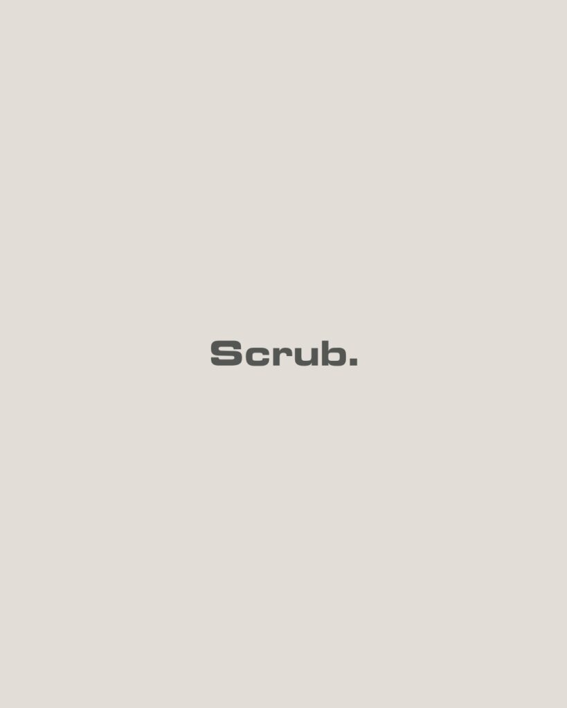
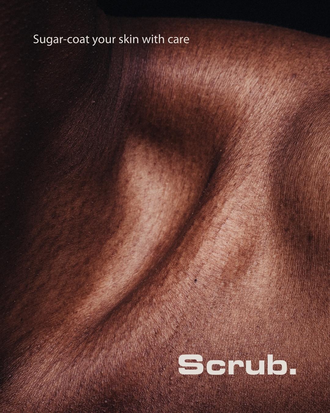
Modern Typography: A minimalist font was selected to align with the brand’s contemporary image. The typography conveyed a sense of approachability.
Clean Graphics: Simple graphics and uncluttered layouts in the branding elements and packaging design helped communicate Scrub.’s commitment to purity and simplicity.
Strategy
By leveraging playful yet muted colors, modern typography, and clean graphics, Scrub. effectively captures the attention and loyalty of the Gen Z demographic. The brand now stands as a trusted and recognizable name in the beauty industry, offering high-quality sugar scrubs that align with the preferences and values of their target audience.